
blog

A website is part of your communication strategy
A website is often one of the first places people go when they want to understand an organisation or project.
What do you do? Why does it matter? What have you achieved? Where can I find more information? A good website should make those answers easy to find.

Motion makes complex ideas easier to understand
Some ideas are difficult to explain in a single image. Motion graphics allow information to appear in a sequence, directing attention and helping audiences understand how different elements relate to each other.
Every communication channel should tell the same story
Organisations rarely communicate through a single piece of content.
A report is published. A presentation is delivered. A website is updated. A social media post reaches a new audience. An event brings people together. Each touchpoint has its own purpose.

Why good design starts before the visuals
People often think design starts when the first visual concept appears on screen. In our experience, it starts much earlier. One of the biggest lessons we have learned over the past 10 years is that the strongest projects are rarely the ones with the most creative layouts. They are the ones built on the clearest understanding.

Reports deserve more than layout
Reports are often one of the most important communication tools organisations produce.
They contain research findings, recommendations, project results, policy proposals and strategic insights. Yet many reports are treated as a final formatting exercise.

How to communicate research findings to non-specialists (2026 guide)
Research creates value when people can understand and apply it. Across Europe, universities, NGOs, research centres and EU-funded projects generate an enormous amount of knowledge every year. Their reports contain evidence that can influence public policy, improve...
Complex information should feel simple
One of the most common misconceptions about communication is that complexity is unavoidable. It is not.
Some topics are naturally complex. Research projects, public policy, sustainability, health, energy or European programmes often involve large amounts of information, multiple stakeholders and technical language.

Data becomes powerful when it’s visual
One of the most important lessons we have learned over the past 10 years is that data alone rarely creates impact.
Most organisations already have valuable information. Research findings, surveys, technical studies, performance indicators and project results are generated every day across organisations of all sizes.
Why long-term collaboration creates stronger communication projects
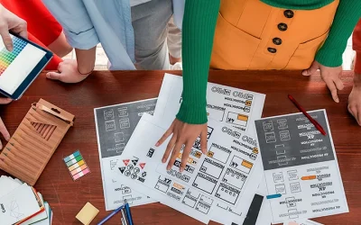
Long-term collaboration changes the way communication projects evolve. While many design projects are approached as isolated deliverables, communication systems become significantly more effective when teams work together over time. This is particularly relevant for...